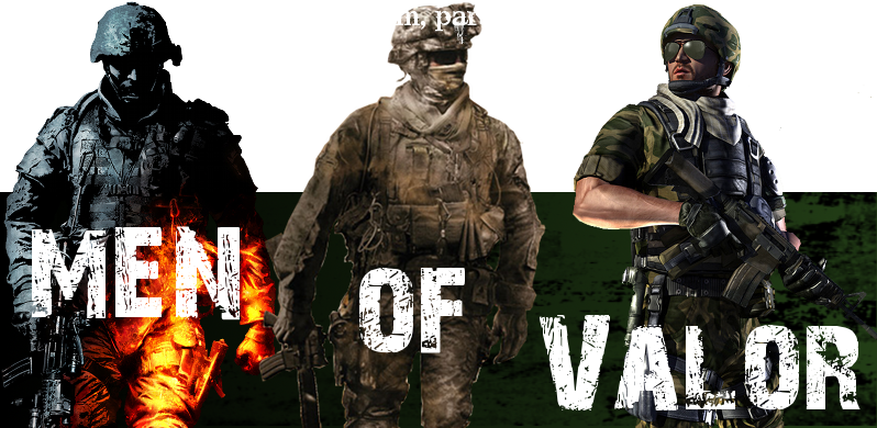
Draft 1:
After last nights meeting I decided that I might as well go ahead and make an attempt at one and see what you guys think so here it is. Please tell me stuff I should remove/change/add for another version. If you absolutely hate it that's fine it was just an attempt, but just post please. Here it is:
Draft 2:
Okay so after a couple more days, (yes I lied, I'm sorry, not much homework tonight) I've revised it according to your advice. Now when making it I had to resize the three figures to fit the more banner-sized image shape, so therefor there was more open space left throughout. To resolve this I'm going to give you guys the choice. I made one version with extra brushwork to fill in these spaces, and the other one with little brushwork to try and leave it as similar as possible, so just post letting me know which one you prefer and all that.
Also just in case you're wondering why it looks different, it's because I had to make a whole new image because resizing the old one screws up the resolution, and reduces the overall quality and polish of the image. Anyway, without further a due, I present two versions of my second draft of my banner.
Least brushing:
More brushing:
Last edited by C-r-o-w-n-z on Tue Apr 13, 2010 9:21 pm; edited 2 times in total


